XO
Logo & corporate identity design
We took up the challenge, facing the following must-haves:
- Create an identity for the future, while retaining the past.
- The rebranding should modernize the brand, but we did not want to lose those elements that made the brand recognizable (and loved) by all.
We aimed to create a brand architecture that would embrace all brand’s existing and future sub-brands with a much needed consistency, while at the same time enabling us to easily showcase the different services and tools offered by them.
We proceeded with the following unavoidable facts in mind:
Fact 1: Everybody refers to the Yellow Pages/ Χρυσός Οδηγός as XO.
Fact 2: We are living in a digital era.
Fact 3: The new laptop/smartphone has replaced the old phone.
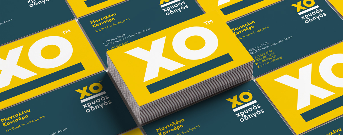
Taking all the above into consideration, we used the initials XO as the main brand vehicle, and utilizing the old image of the phone placed on the closed catalogue we evolved it by visualizing XO placed on a closed laptop, hence creating the line that separated the logo from the description, a concept that served our need for consistency and sub-brand differentiation.
For the mother brand we kept the colours (Yellow and Petrol) of the old identity, so as not to lose the recognition and the important values tightened with the brand.
As for the rest of the brands we kept the yellow as common colour coding and then diversified according to the brand services. For example, we chose a deep clean purple for the digital services as it is a colour linked with technology and perfectly matches the no 1 digital agency (currently handling more than 4.000 websites and over 1.000 campaigns).
Bold and clean, the fonts used, are completely befitting to the character of a bold and reliable company, such as XO.


