Urban Kipos by Praktiker
Logo & corporate identity design
We were assigned the design of the visual identity for the #1 destination; one-stop shop for urban living.
Whether you have 2 sq m or 200 sq m, at Urban Kipos you can find all the products and services that will help you make your space greener & amazing.
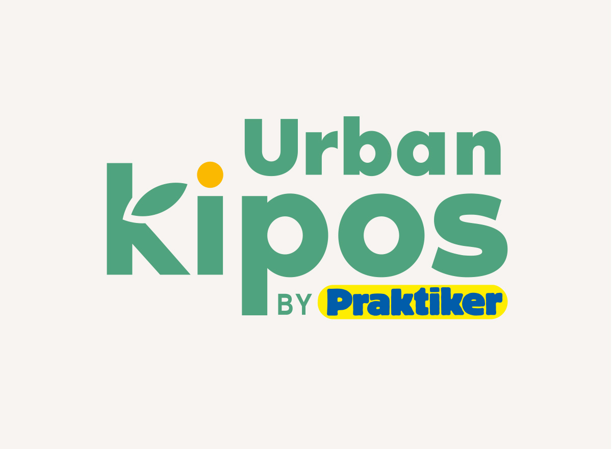
First comes the name: we wanted something different, something fresh, without the word garden. Urban Kipos is a phrase familiar to all and identifiable by all.
Then comes the logo: Our strategy was to create a logo that carries the characteristics that a retail environment requires, such us: consists of clear lines, is approachable, recognizable, and also properly locked in on the mother-brand’s values and design.
Then the house style: We wanted to make an identity that can work both offline & online, to create a happy urban atmosphere, by designing amazing illustrations like flowers and plants with pop style and a coolness twist.
Then the categories and the services: We wanted to create a monolithic brand architecture, but with no limits on the design stretches and adaptations. Therefore, we designed the categories -Cinema Kipos, the Vertical Kipos, the Kiddos Kipos-, and the services -Kipos Experts-, with different characteristics each, but under the same design umbrella.


