Karamolegos
Packaging design
“Paxamas”.
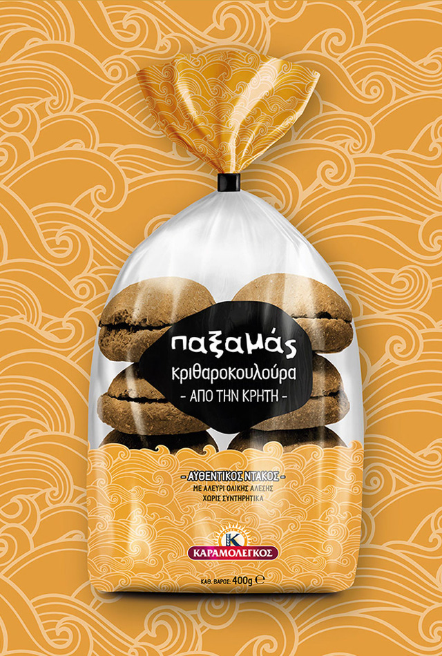
When Karamolegos Bakery entered the rusk market with a new product series, we were called to create its identity.
Regarding the name of the series, we used “Paxamas”, a name for the rusk etymologically coming from the Middle Ages, which clearly reflects the taste and higher quality of the product. The design of the logo was hand-drawn to represent the irregular contour of the rusk. For the patterns of the packaging, we were inspired by the fact that the rusks come from traditional, local producers based in various areas of Greece. We used the different geological features and terrain of the origin of each code to design the shapes and complemented them with a colour palette of earthy and natural shades.


