Our client, a renowned chef celebrated for his soul-stirring flavors and highly personalized service, required a brand identity that reflected both his culinary precision and his heartfelt approach. The goal was to move away from the corporate feel of traditional catering and instead highlight the artisanal, hand-crafted nature of his culinary work.
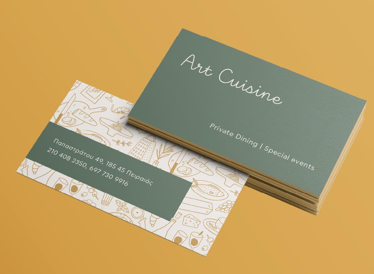
The name Art Cuisine was chosen to serve as a manifesto. It directly frames the chef’s work as a fine art medium, suggesting that every plate is a canvas and every ingredient a deliberate stroke of color and taste.
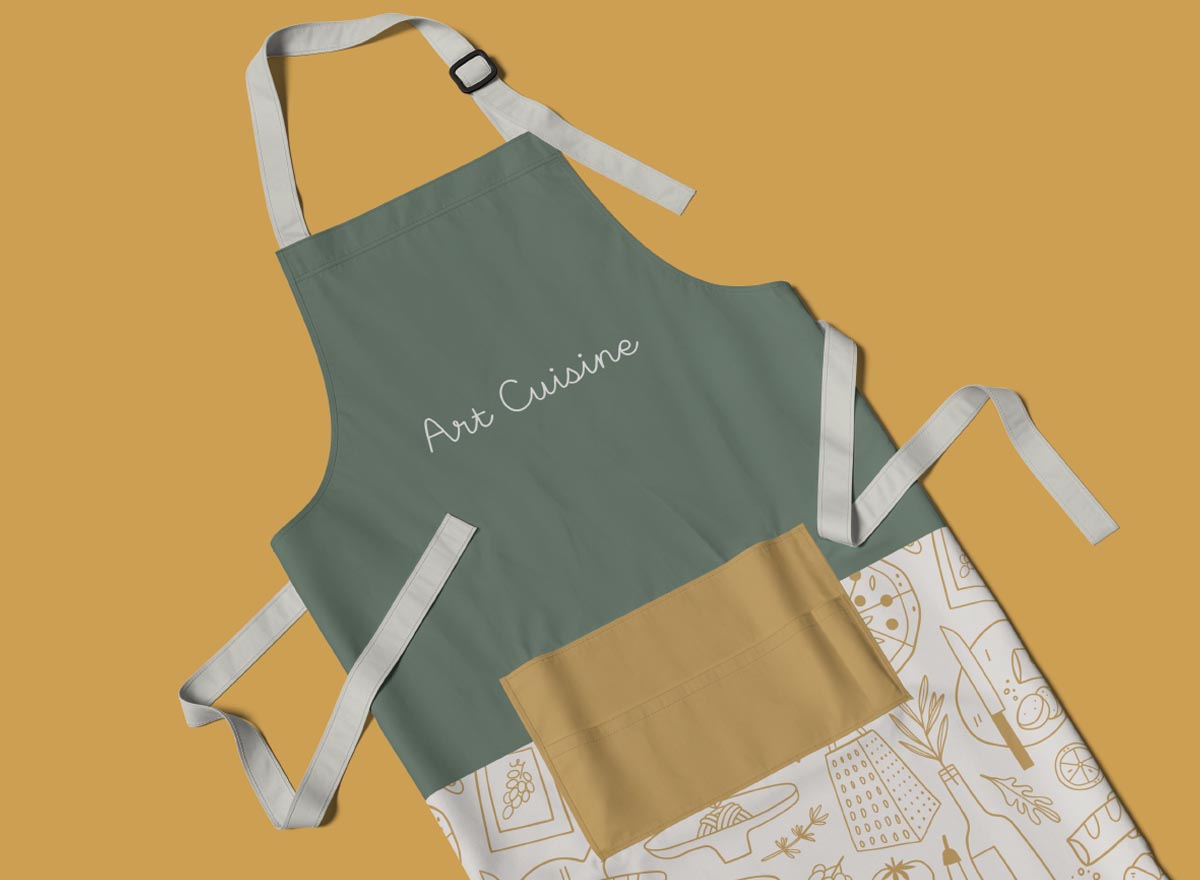
The centerpiece of the identity is the hand-written font used for the logo. This logo functions as a signature, reflecting that the chef personally oversees the customization of every menu to meet the client’s specific needs.
The choice of the colour palette, olive green and warm yellow, moves away from the sterile whites or heavy blacks common in luxury catering, opting instead for a palette rooted in the Mediterranean and the garden. Olive green: Provides a grounded, sophisticated base. It speaks to the raw, organic produce and the chef’s respect for the source of his ingredients. Warm yellow: Represents sunlight, citrus, and the vibrancy of the finished dishes.
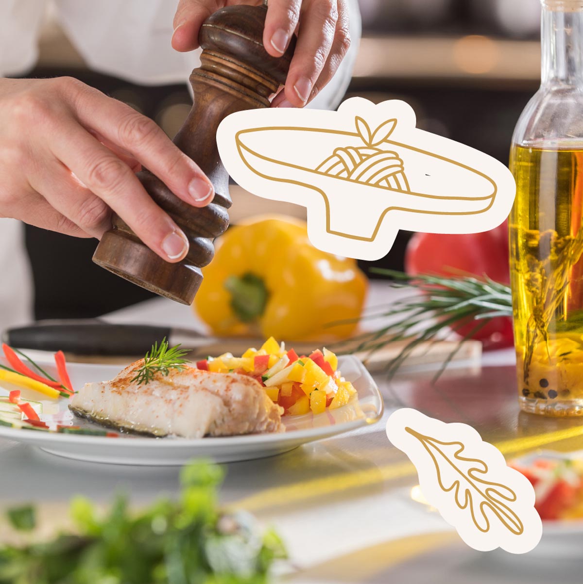
Finally, the housestyle is created by a collection of graphic illustrations related to catering. Rather than using generic icons, these graphics are in a style that mimics sketches. This technical yet organic aesthetic emphasizes the “well-thought” planning and precision behind every event, highlighting that the chef’s process is as much about structural design as it is about flavour.
The Art Cuisine identity successfully translates the chef’s culinary philosophy into a visual brand and clearly communicates that this is not just catering, but a personalized masterpiece created for a single event.